
Redesigned the Wi-Fi management experience for the BT Business mobile app, enabling 2 million+ business customers to set up hubs, manage devices, control security settings, and access diagnostic tools confidently without relying on phone support.
Role: Lead Product Designer · UX/UI · Illustration · Usability Testing · Cross-platform Design
Challenge
Small business owners needed professional-grade network control without IT expertise. BT Business required a mobile app that could handle hub setup, 4G configuration, security management, and diagnostics all whilst feeling simple enough for a café owner or shop manager to use confidently.
The existing experience was fragmented and intimidating:
Setup Abandonment Crisis: Over 60% of customers failed to complete hub setup independently, defaulting to expensive phone support or engineer visits that cost BT millions annually.
Security Paradox: Business customers needed robust network protection but weren't IT professionals. Existing controls were either too technical or dangerously oversimplified.
Device Ecosystem Chaos: Multiple hardware types (Smart Hubs, 4G discs, Wi-Fi extenders) with different capabilities left users confused about what connected to what.
Revenue at Risk: When business Wi-Fi goes down, revenue stops. Users needed absolute confidence that changes wouldn't break connectivity and mistakes could be reversed.
Process
I led the design with a "Guide, Don't Gatekeep" philosophy - empowering users through clarity rather than hiding complexity behind oversimplified interfaces.
Discovery & Understanding
Spoke with 12 business owners across retail, hospitality, and professional services to understand how they thought about their networks and when they needed to interact with Wi-Fi settings
Analysed 6 months of support call transcripts to identify common failure points in setup and troubleshooting journeys
Conducted competitive analysis of consumer Wi-Fi apps (Google Wi-Fi, Eero, Netgear) and enterprise solutions to identify patterns users might already know
Mapped the physical installation environment - business owners often set up devices in awkward locations (behind counters, in storage rooms) using one hand whilst holding their phone
I partnered with the customer success team who managed hardware logistics and hub dispatch. This was important for two reasons: first, I wanted to understand the physical hardware constraints so the app UI accurately reflected what customers were actually setting up. Second, I wanted to align the digital experience with the physical unboxing journey, so customers had a consistent, joined-up experience from the moment the hub arrived at their door to the moment they were connected.
Critical User Insights
Through research, three insights shaped our approach:
"I don't know what I don't know": Users didn't lack intelligence, they lacked context. Terms like "SSID," "WPA2," or "MAC address" were meaningless. But "Wi-Fi name," "password," or "device ID" clicked immediately.
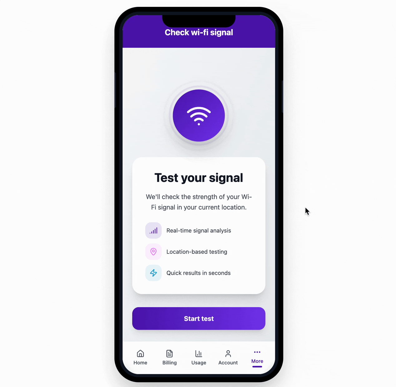
Visual progress builds confidence: Users repeatedly asked "Is it working?" during setup. They needed constant reassurance through visual feedback, not just spinning loaders. One participant said: "I don't mind waiting if I know it's actually doing something."
Mistakes must be reversible: Business owners feared breaking their network during business hours. The ability to undo changes or preview impact before confirming was psychologically critical - even if they rarely used it.
Learnings from Early Iterations
Minimal "Apple-style" Setup: Influenced by consumer product design, we created a minimalist flow with limited explanatory text. Without technical confidence, users needed guidance. "Simple" became "confusing." Setup abandonment actually increased.
Technical Language: Early prototypes used networking terminology. Testing revealed users simply didn't understand what "SSID broadcast" or "WPA2-PSK encryption" meant, not because they were incapable, but because the language was foreign to their mental model.
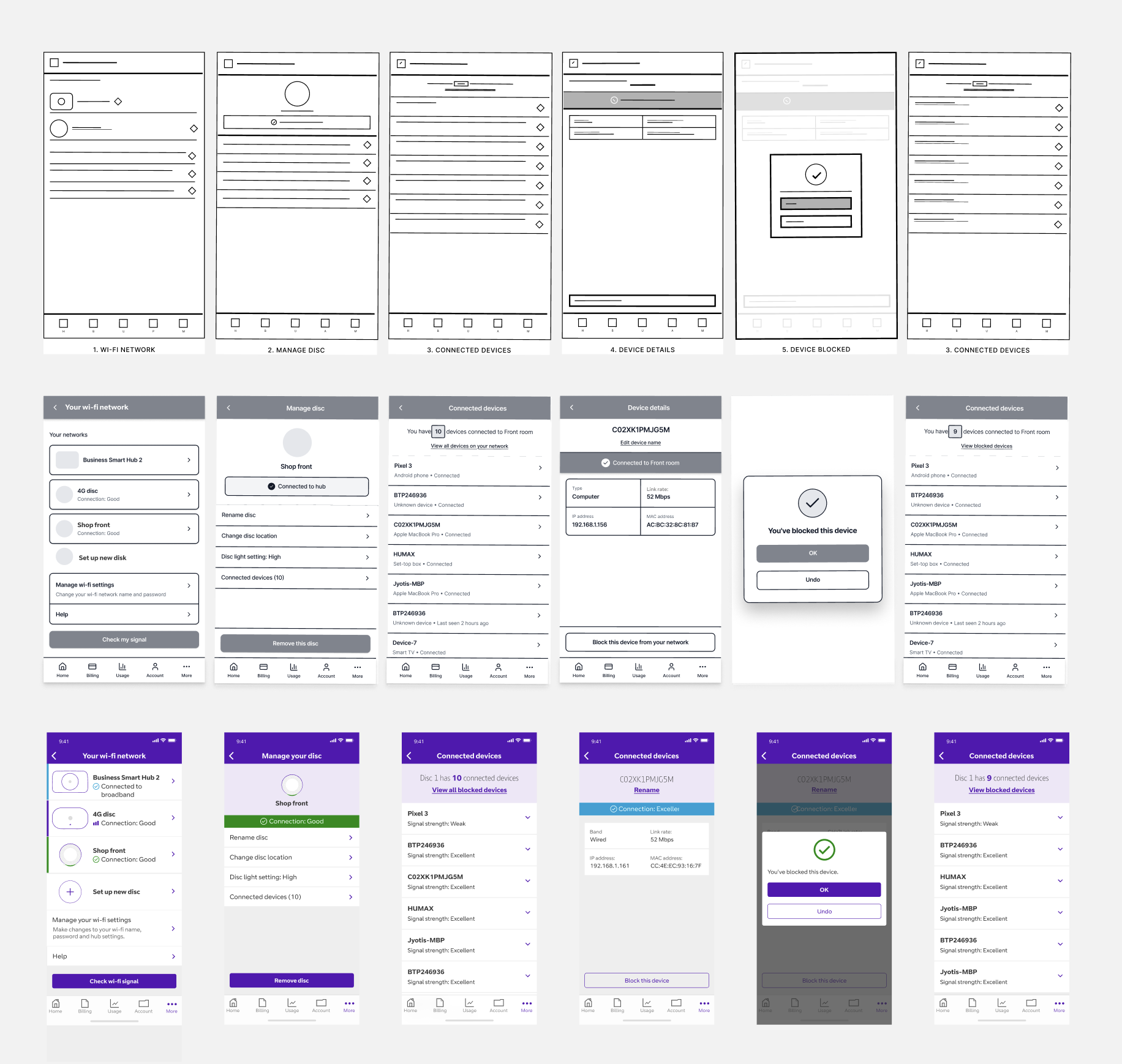
Design Process: Wireframes to Final UI
Device Management & Blocking flow
The Solution: Progressive Guidance
The final design balanced simplicity with confidence-building through three core principles:
Task-Based Architecture Instead of feature buckets ("Settings," "Devices," "Security"), we organised around jobs to be done: "Set up new hub," "Block a device," "Check my signal." Users could jump straight to their task without navigating through menus.
Contextual Explanation Every screen answered: "What am I doing right now?", "Why does this matter?", and "What happens next?" This kept users oriented without overwhelming them with upfront information.
Visual Certainty Progress indicators showed not just percentage complete but what specifically was happening ("Connecting to your hub," "Checking your network"). Success states were celebratory. Error states offered clear next steps, not technical codes.

Key Design Decisions & Trade-offs
1. Guided Setup vs. Expert Mode
The Tension: Engineering initially proposed a power-user mode for technical customers a separate advanced flow where IT-savvy users could configure everything at once.
My Decision: I challenged this. On mobile, exposing all network settings simultaneously isn't just bad UX, it's genuinely risky. One misconfigured setting could take down a business's entire network. A single guided path protected everyone.
What I Sacrificed:
Technical users moved through the flow slower than their expertise required
No opportunity to market or monetise a separate 'pro' tier
What I Didn't Expect: Technical users actually appreciated the guardrails. On a live business network, speed matters less than certainty.
The Result: Setup completion rose from 36% to 91%. The unified path meant we could optimise one journey relentlessly rather than maintaining two mediocre experiences.
2. Security Notifications: Proactive vs. Reactive
The Tension: Should we proactively notify users when unknown devices connected (potentially alarming but secure) or let them check manually (calmer but potentially missing threats)? Security stakeholders wanted immediate alerts for everything.
My Decision: Smart notification system that learned normal patterns. Only alerted for genuinely unusual connections - new device types, midnight connections when business was closed, sudden spikes in connected devices.
What I Sacrificed:
The "safety theatre" of constant notifications that might feel more secure
Immediate alerts for every connection that some users expected from home routers
Simpler engineering - pattern learning required backend complexity
The Result: Alert fatigue eliminated. When users received a notification, they took it seriously, block rate for flagged devices was 73% vs. 12% in the "notify everything" prototype. Users reported feeling more secure because alerts were meaningful, not noise. One café owner said: "I actually check these now because they matter."
3. Illustration System: Photorealistic vs. Simplified
The Tension: Should device illustrations match actual hardware exactly (helpful for identification) or use simplified, stylised versions (better for small screens and faster to update)? Brand team wanted photorealistic to showcase hardware; Engineering wanted simple SVGs for performance.
My Decision: Hybrid approach - photorealistic thumbnails for device identification in lists, simplified line illustrations for instructional flows. Built a comprehensive illustration library covering every setup step, error state, and success moment.
What I Sacrificed:
Perfect visual consistency (mixing realistic and simplified felt initially jarring to stakeholders)
Easier maintenance (two illustration styles to update when hardware changed)
The Result: Users could identify their physical hardware from photos but weren't overwhelmed by visual detail during setup. The illustration system became a design asset used across other BT Business products, creating unexpected value. Usability testing validated the hybrid approach - realistic for "what" questions (device identification), simplified for "how" questions (setup instructions). Brand team eventually advocated for the system after seeing customer feedback.
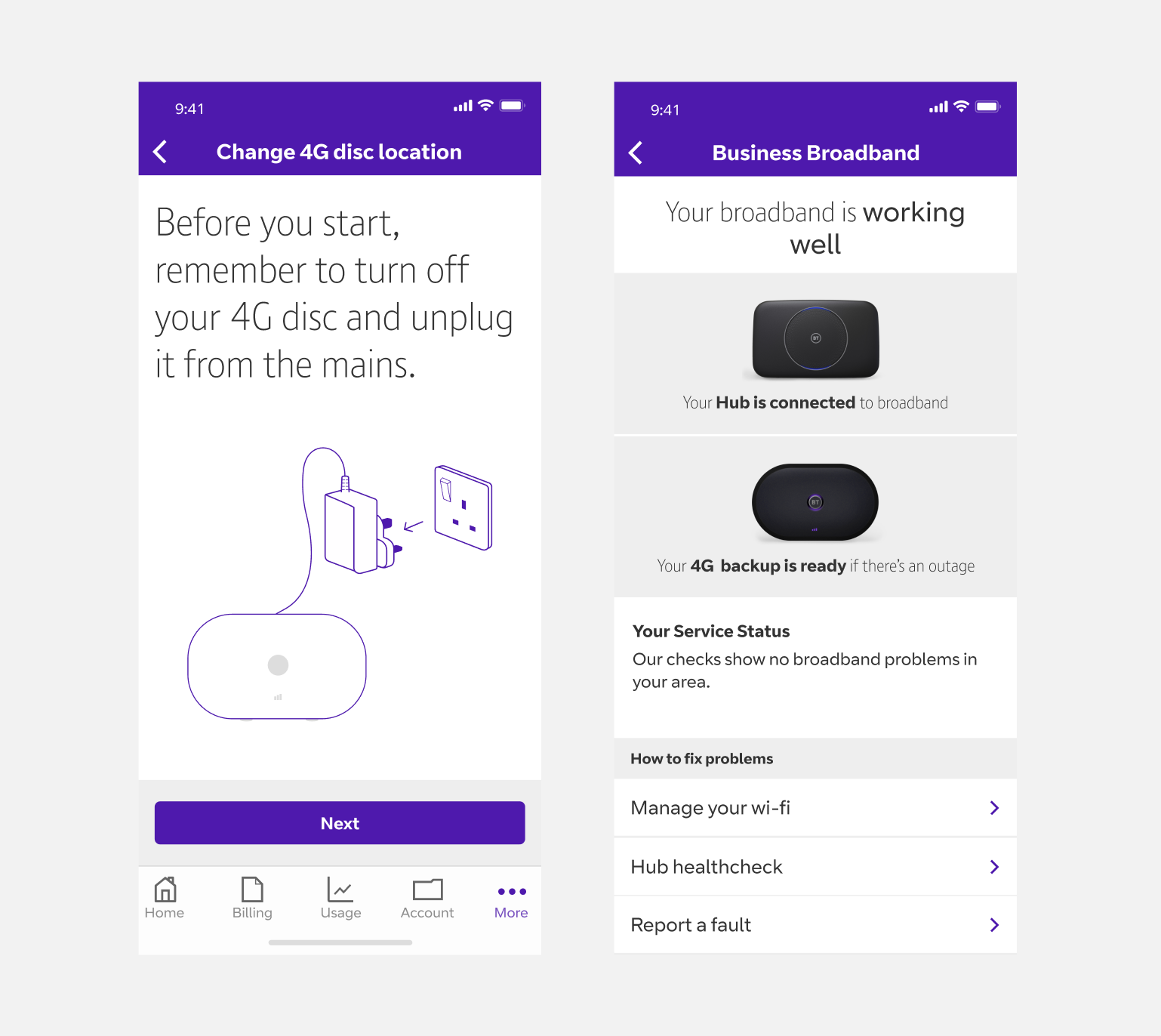
Photorealistic thumbnails for device identification and simplified line illustrations
Outcome
Transformed Support Economics: Shifted Wi-Fi management from a cost centre to a value driver. Support call reduction saved BT an estimated £2.4M annually.
Established Scalable Patterns: Created design system and interaction patterns that accommodated all current device types. When BT launched other devices, they integrated seamlessly into existing flows.
Enabled Feature Velocity: Clear component library and established patterns allowed us to ship guest Wi-Fi, parental controls, and usage monitoring in subsequent quarters - features that would have taken months in the fragmented old system.
Improved Business Customer Perception: App Store ratings improved from 3.2 to 4.1. Reviews specifically mentioned "actually works" and "finally makes sense" directly addressing previous pain points. NPS increased by 23 points.
Cross-Platform Foundation: Tablet-optimised layouts meant business owners could manage networks from office iPads, expanding use cases beyond emergency phone fixes.
Design System Impact: The illustration library and component patterns were adopted by three other BT Business product teams, creating consistency across the ecosystem and reducing design debt.

Tablet designs
