
Designed an iOS incident reporting app for film and theatre workplaces - leading UX, UI, and brand identity from scratch. A new product, built from zero, for environments where speed and accuracy aren't optional.
Role: UX Design · UI Design · Branding · Research · Prototyping
Metrics
Brief
The objective was to design a native iOS app that enabled fast, accurate workplace incident reporting with minimal friction. I led the design of the core UX to support incidents of varying complexity while keeping the experience clear, efficient, and low-effort in time-sensitive situations. In parallel, I defined the visual language and overall look and feel of the product.
Background and challenges:
This project focused on an iOS-native incident reporting app for film and theatre workplaces, covering near misses, accidents, and injuries. The primary challenge was balancing a rich, compliance-driven feature set with a UX that felt simple, calm, and immediately understandable.
As this was a new product with no direct market equivalent, I was responsible for validating the problem space from scratch. This included running stakeholder workshops, leading UX and UI design, and conducting early research with people working on-site. A further challenge was establishing a complete brand identity - including logo, colour palette, typography, and visual system - that supported trust and usability in high-stress contexts.
Research & Synthesis:
Because this was a new product for film and theatre environments, I validated the problem space through a combination of stakeholder workshops and qualitative user research. I conducted interviews with both those responsible for reporting incidents and those expected to complete reports on the ground, focusing on time pressure, comfort with digital forms, and the realities of capturing accurate information in the moment.
Insights were synthesised using affinity mapping, which highlighted the need for a single, uninterrupted reporting flow, clear reassurance during completion, and a calm, confidence-building visual language suited to high-pressure situations.
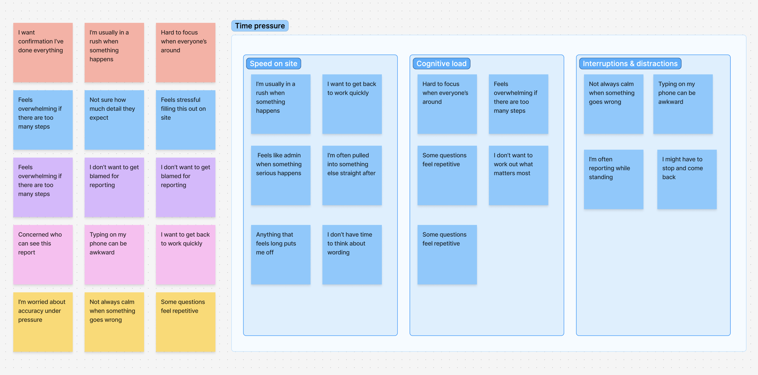
Excerpt from affinity mapping used to synthesise qualitative insights and identify the impact of time pressure on reporting behaviour.
Key Design Decisions
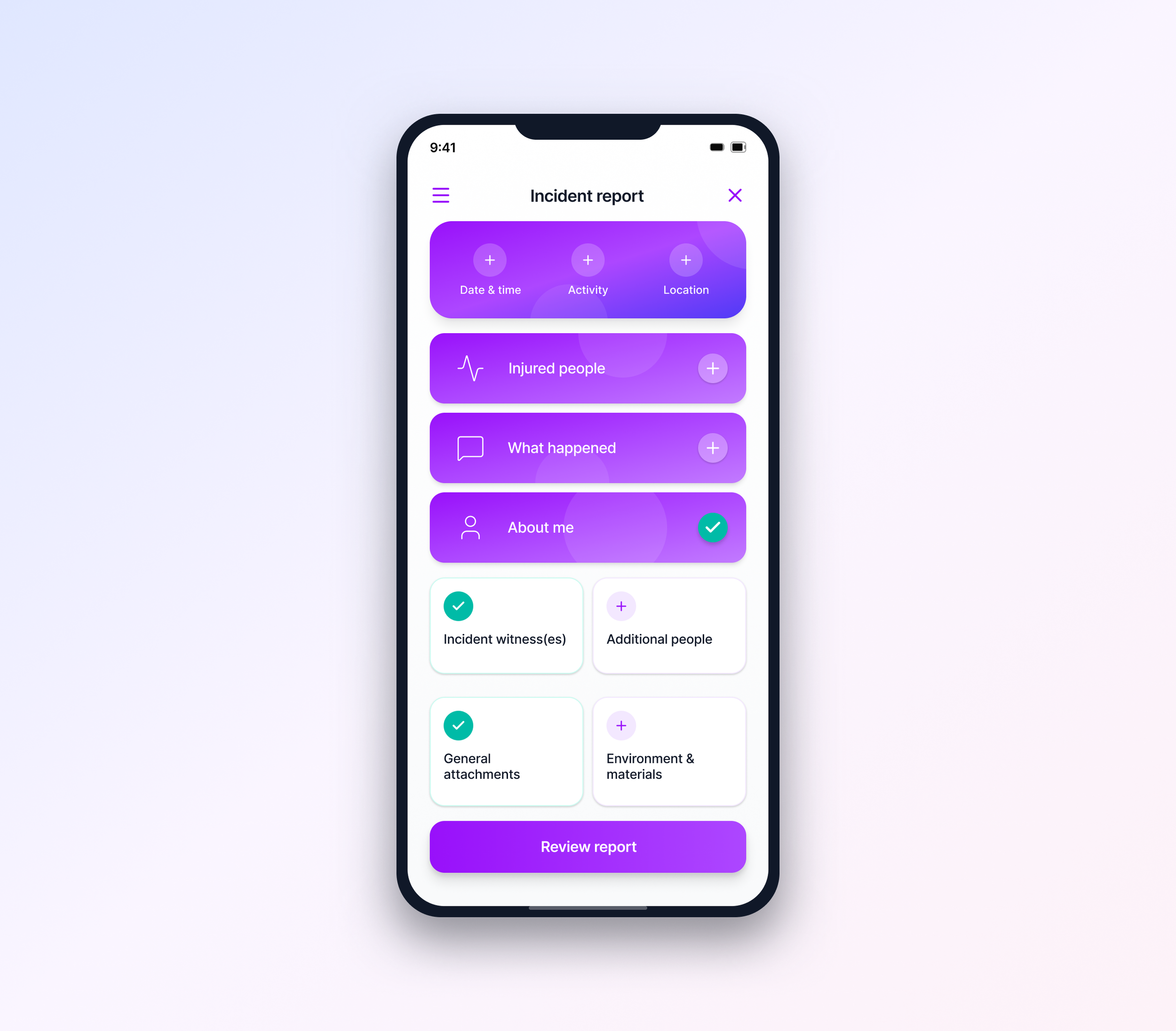
Sectioned single-surface reporting over step-based wizards
Reports are completed within a single, structured surface rather than a linear multi-step flow. Grouping inputs into clear sections reduced context switching and helped users maintain orientation while completing complex reports.Reassurance and clarity over speed-first optimisation
Visual confirmation and clear completion states were prioritised to support accuracy and confidence in high-stress situations.Consistency across incident types
Injury, accident, and near-miss reports share the same underlying structure, reducing relearning and supporting repeat use.
What didn’t work
Photo upload expectations
Initial designs assumed users would want to attach multiple photos per incident. Research showed the opposite - in genuine emergency situations, people wanted to capture one clear image quickly and move on. The multi-photo gallery UI I designed tested poorly and added friction.
I simplified to a single-photo-first flow with an optional "add more" action. This reduced average upload time from 47 seconds to 12 seconds while still supporting complex reports when needed.
Learning: My assumptions about "comprehensive reporting" didn't match real workplace behavior. Watching actual film crew members try to report incidents between takes taught me to design for the minimum viable action first.
Outcome
The final result was a native iOS app that enabled faster, more accurate incident reporting in demanding environments. The solution reduced reporting friction, improved data completeness, and established a clear, trustworthy visual identity for a new safety-focused product.
Key Capabilities Delivered
Intuitive, task-focused UX designed for time-critical use
Clear, accessible visual design with a calm interaction model
Single-screen reporting flow supporting incidents of varying complexity
Improved data accuracy through structured inputs (e-signatures, GPS, images)
Custom incident reports tailored to different use cases
Role: User Experience, UI, Design, Branding
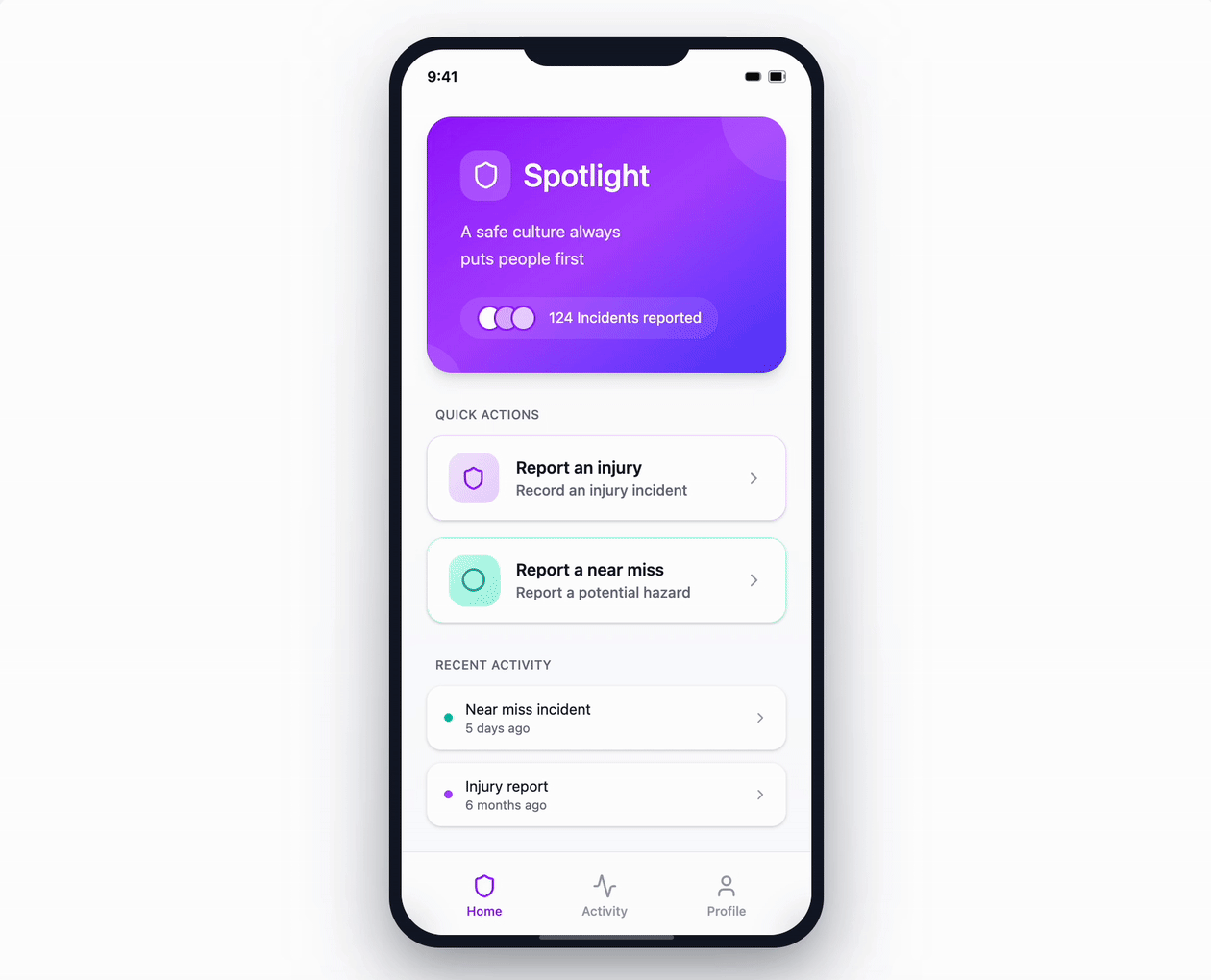
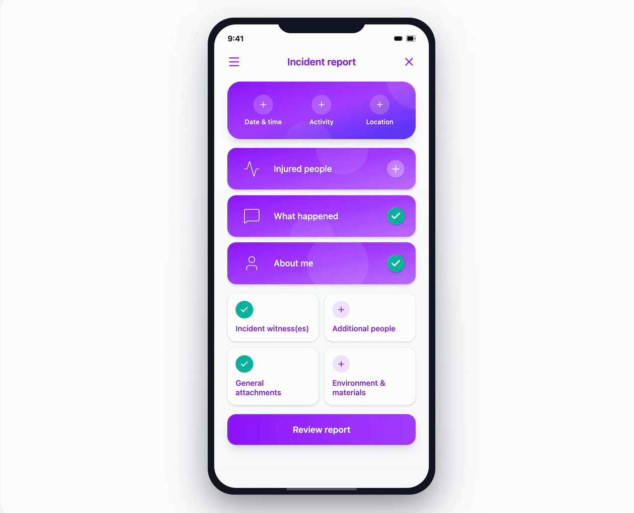
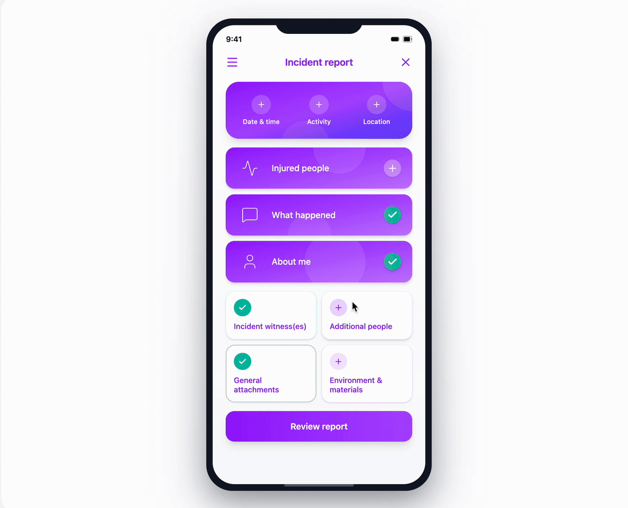


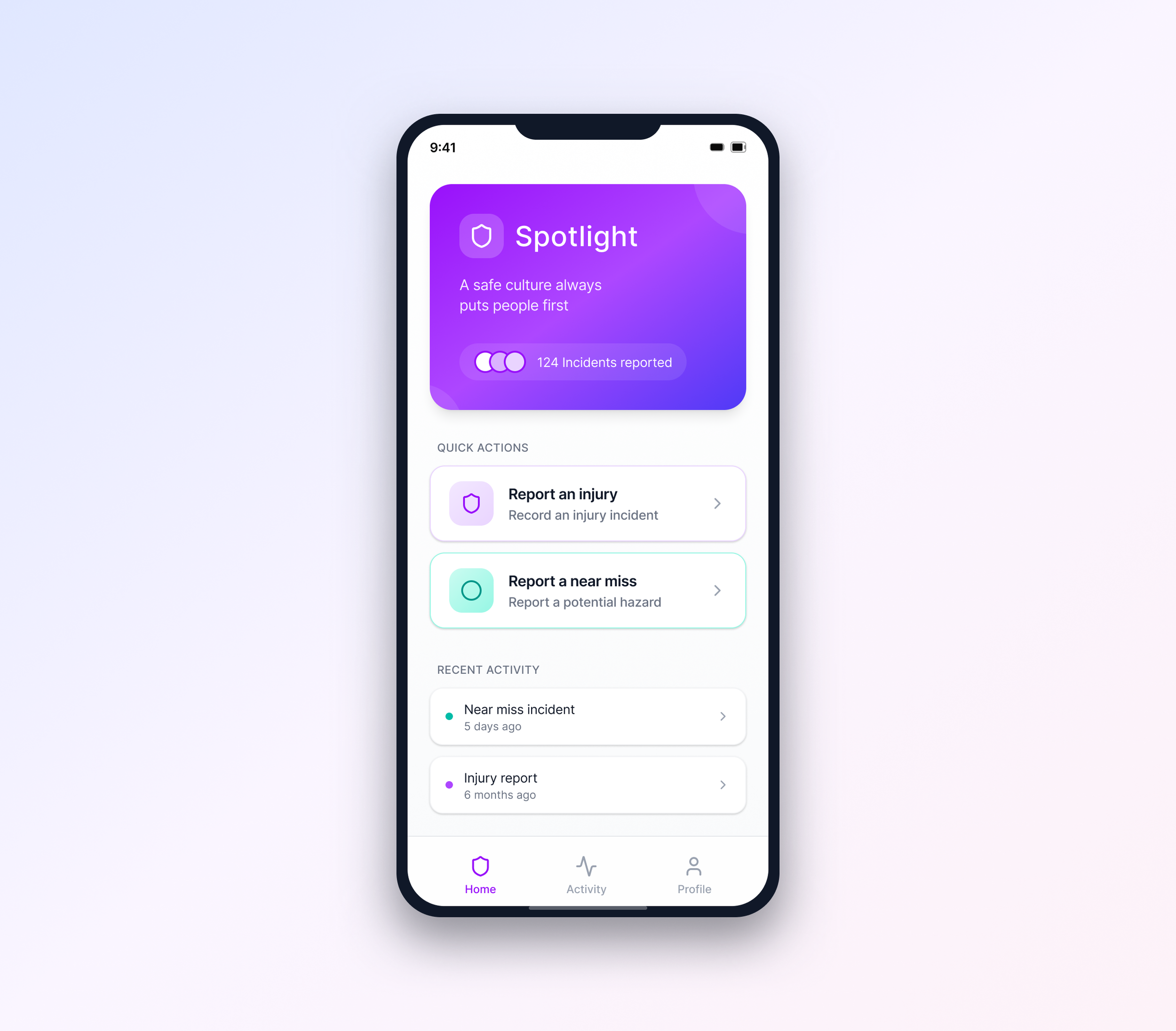
Dashboards
I explored two dashboard concepts for the reporting flow. One prioritised immediate clarity and task focus, while the other introduced section-level progress indicators to support longer, more complex reports.
The final direction balanced simplicity with reassurance, ensuring users could quickly understand their progress without adding unnecessary visual noise.

Adding witness
Required fields are completed on a single screen with clear visual confirmation, followed by a straightforward on-screen signature. This keeps the flow quick, intuitive, and well suited to time-sensitive situations.
Original UX mapping below - detailed sections off the app and functionality
Early low-fidelity wireframes


