
Designed an end-to-end digital renewal journey that shifted customers away from call-centre renewals, reduced friction during price increases, and maintained trust while lowering operational cost.
Role: Lead UX/UI · Research · Prototyping · Usability testing · Delivery with Product & Engineering
Metrics
Challenge:
Challenge: BT faced a critical challenge in retaining customers as contract renewal prices increased. Traditionally, the renewal process was handled over the phone, resulting in high operational costs, inconsistent user experiences, and drop-offs due to friction in the journey. The goal was to shift this process to a seamless digital experience while maintaining customer trust and minimising churn.
This required addressing several key obstacles:
Reducing Customer Drop-Off: Ensuring customers felt confident in renewing their contracts despite price increases by improving transparency and value communication.
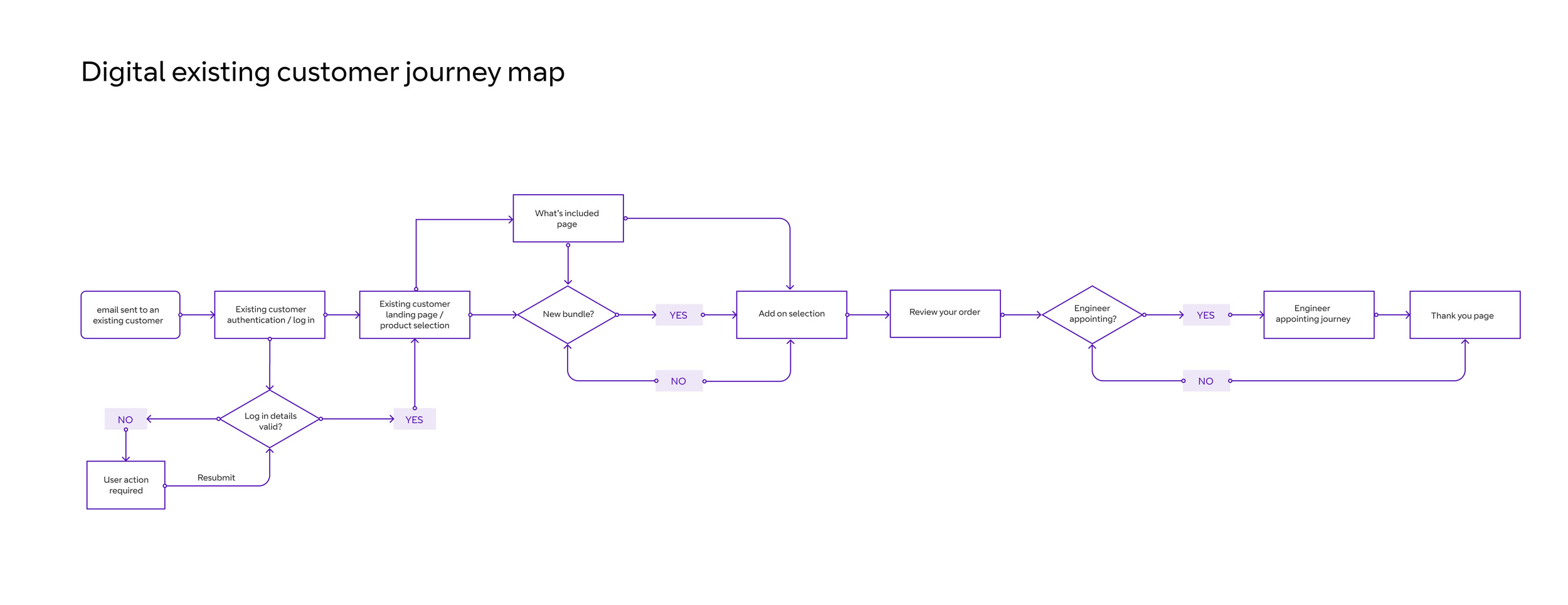
Seamless Service Transition: Creating an intuitive digital journey that maintained the level of guidance previously offered through phone agents.
Complexity vs. Simplicity: The renewal process involved multiple variables, including contract terms, personalised offers, and engineer appointments, which had to be simplified without losing critical information.
Adoption & Behaviour Change: Encouraging users, especially those accustomed to phone-based renewals, to transition to an online-first experience.
Business Efficiency: Reducing reliance on call centres while ensuring high customer satisfaction and increasing opportunities for upselling additional services.
Process:
Our squad followed a user-centred, iterative approach guided by the mantra: "Think, Create, Learn, Iterate." The process was designed to ensure that customer insights drove every decision, balancing business objectives with a seamless user experience.
Discovery & Research
Conducted in-depth stakeholder workshops to align business goals with user needs
Developed user personas based on qualitative interviews and behavioural data to understand pain points, motivations, and renewal decision-making factors
Carried out ethnographic research to identify why customers preferred phone renewals and what barriers existed for digital adoption
Analysed call centre transcripts and customer service logs to map common frustrations and knowledge gaps
Benchmarked against competitor journeys to identify industry best practices and innovative approaches
Used affinity mapping to cluster user insights into recurring themes, helping shape our problem definition and prioritisation
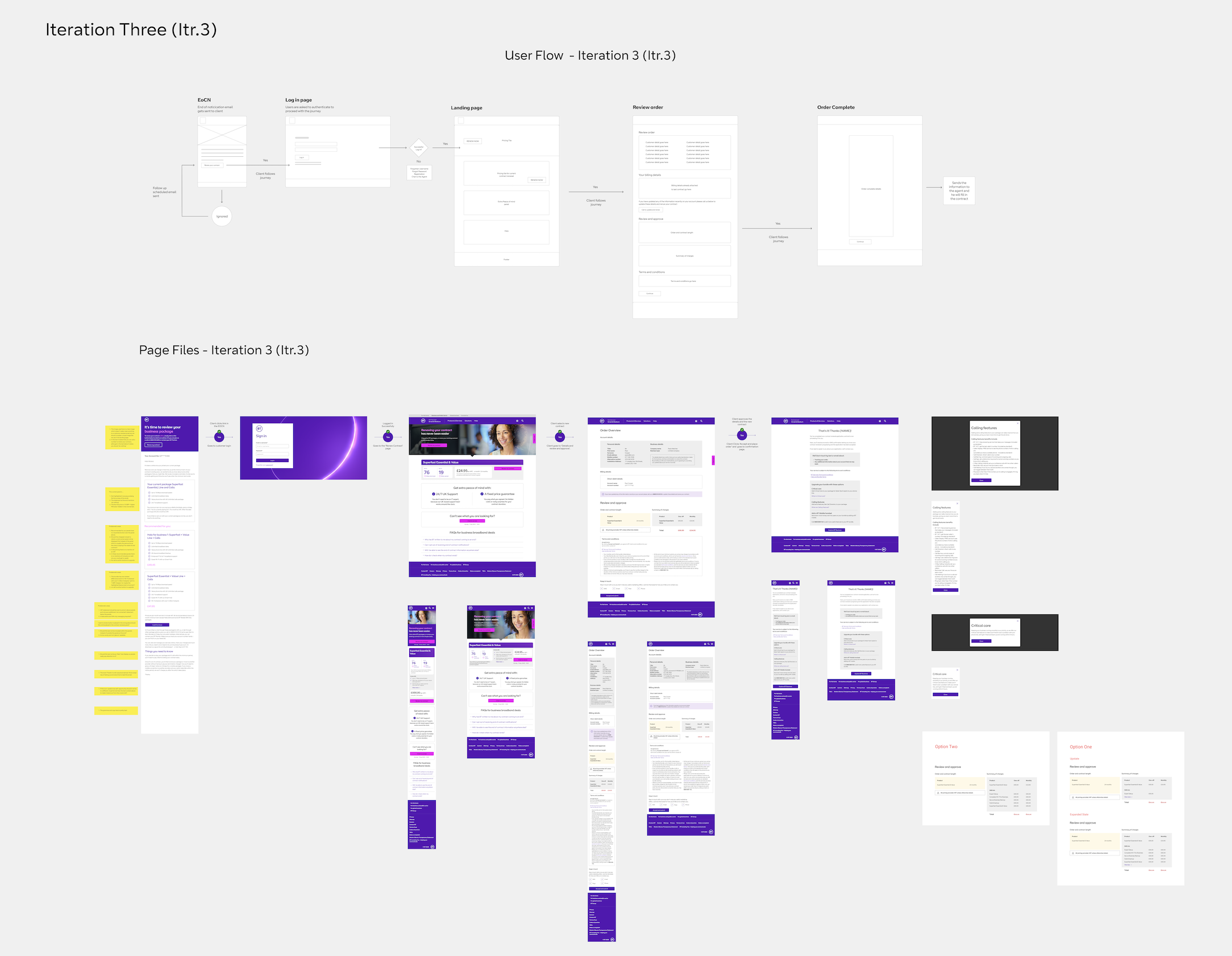
Learnings from Early Iterations
Through testing, we learned what didn't work:
Chatbot Assistance: Users found conversational UI patronising and untrustworthy, preferring transparent self-service over guided assistance.
Gamified Progress Indicators: Visual journey maps were completely ignored - users wanted task completion, not ceremony.
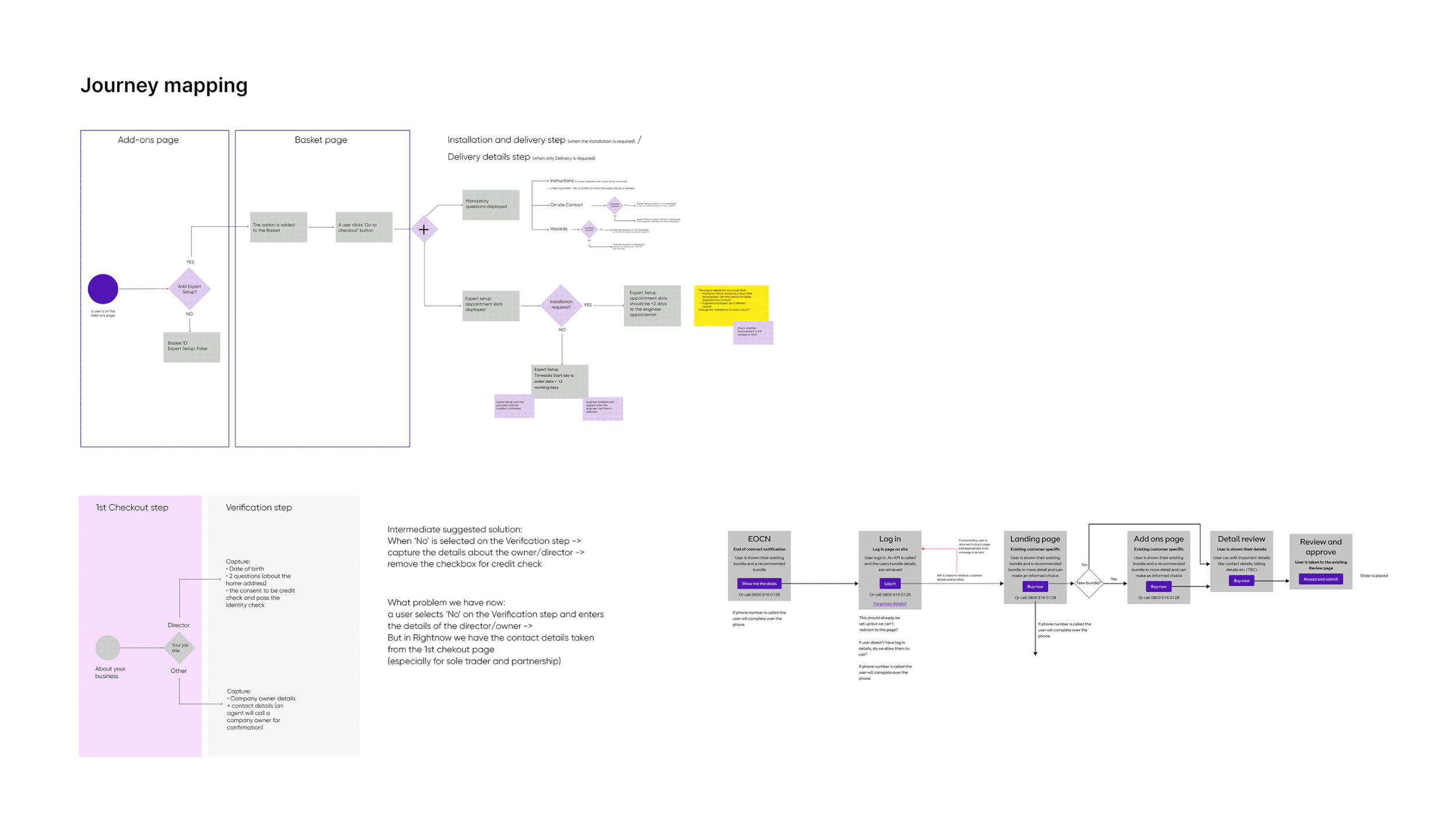
Engineer Appointment Integration Initial designs didn't include appointment booking within the renewal flow - users had to wait for a follow-up call to schedule installation. This created anxiety and friction, as users wanted to complete everything in one go and have certainty. We later integrated appointment scheduling into the journey.
Affinity Mapping
To uncover underlying user needs and patterns, I used affinity mapping to cluster qualitative insights from interviews, call transcripts, and usability sessions. This exercise surfaced five key themes – Trust & Transparency, Guidance & Support, Digital Readiness, Perceived Value, and Process Frustrations. Mapping these pain points helped move beyond individual complaints and shape a clearer problem definition, directly informing our experience strategy for the new digital journey.
User Testing
We conducted regular usability testing to validate each iteration of our product. Every update and improvement was informed by user feedback, ensuring continuous refinement. Below is an example of a test run used to validate changes based on previous user insights.

Key Design Decisions & Trade-offs
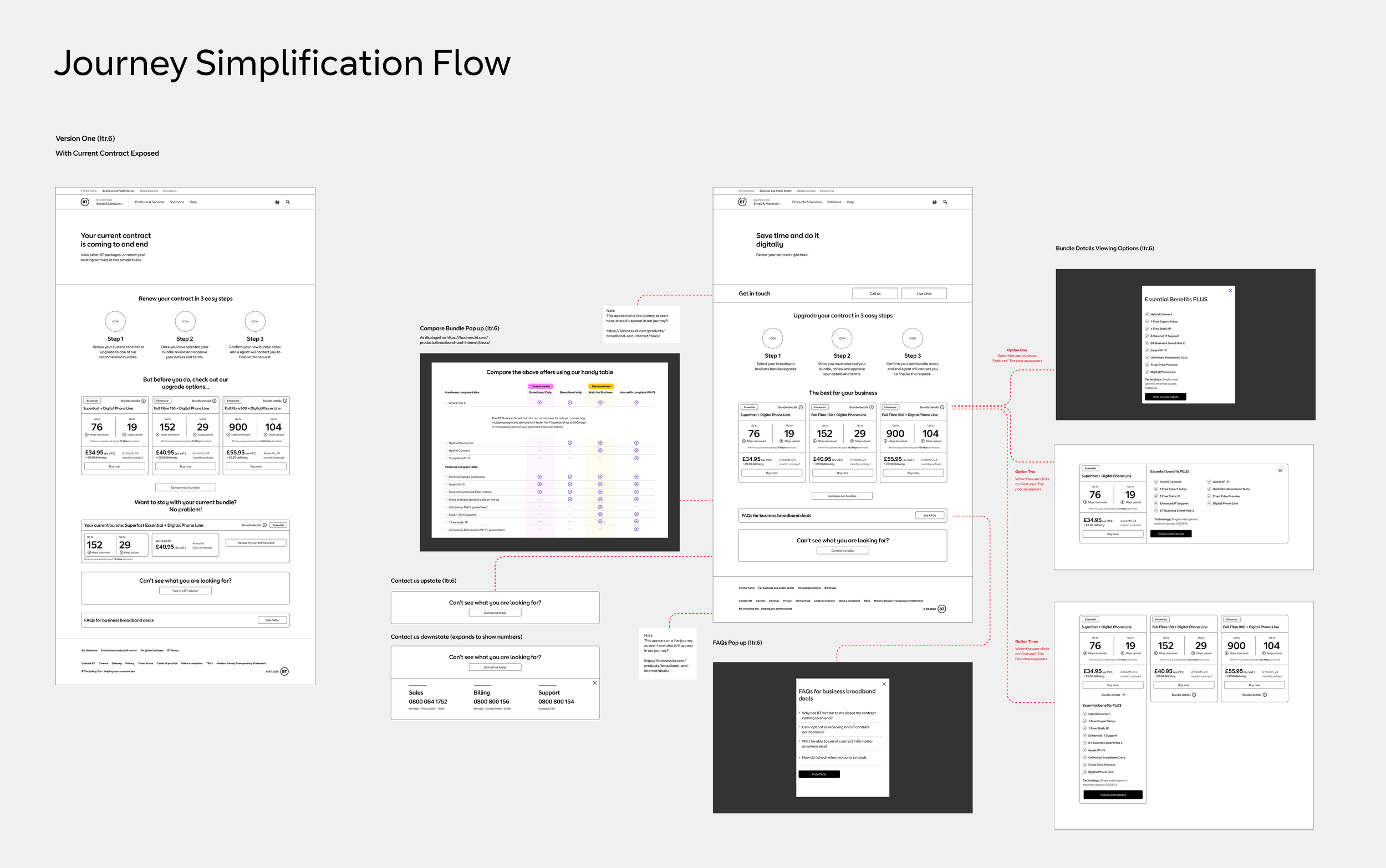
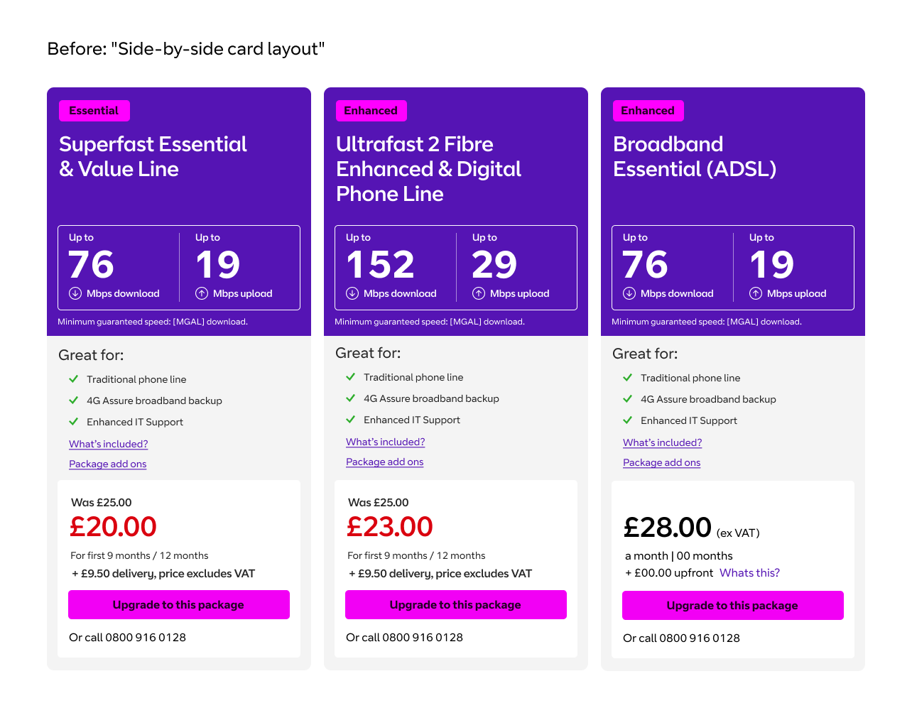
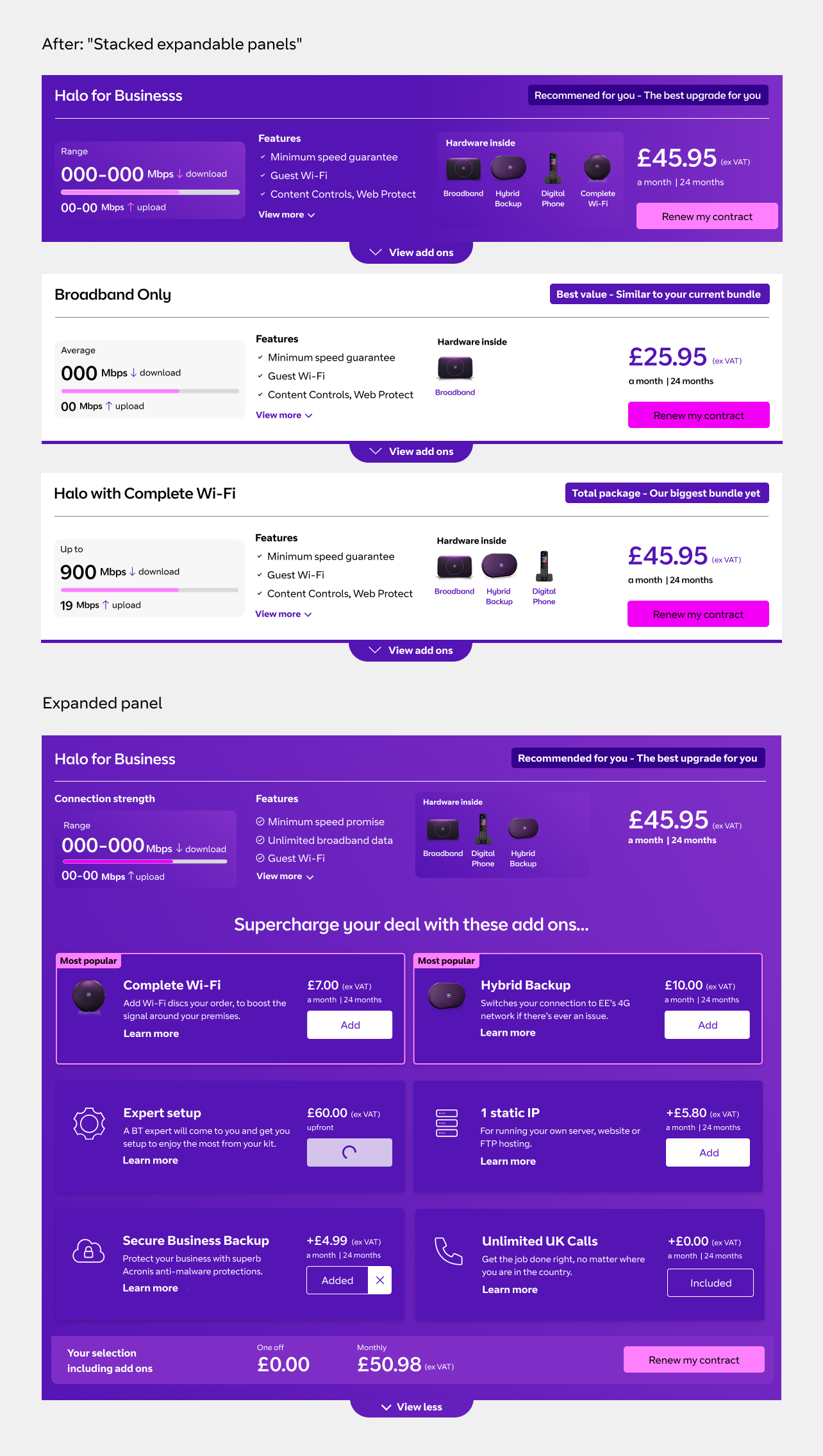
1. Stacked Expandable Panels vs. Side-by-Side Product Tiles
The Challenge: The original design displayed product packages as side-by-side tiles with limited vertical space. Critical information like add-ons, inclusions, and package benefits were buried and required users to click "View add ons" or "View more benefits," taking them to separate pages. This caused significant drop-off - users lost their place in the journey and couldn't easily compare what was included in each package.
The Solution: I redesigned the layout using stacked, expandable panels. Each package now had collapsible sections like "View add ons" and feature lists that opened inline, keeping users on the main screen. The vertical stacking gave each package more breathing room to display connection speeds, features, hardware, and pricing clearly upfront.
The Trade-off: By consolidating information into expandable inline modules, we had to be selective about what appeared by default versus what lived behind "View more" or "Learn more" links. We couldn't show every single feature or add-on option at once - we prioritized what research told us users needed to make a decision (speed, price, core features, popular add-ons).
What I Sacrificed:
Side-by-side comparison: Users couldn't view all three packages simultaneously anymore, which some stakeholders worried would reduce package consideration
Information density: We had to reduce granular details visible by default, relying on progressive disclosure through expandable sections
Screen real estate efficiency: The stacked layout meant more scrolling, particularly on mobile
The Result: This approach won our internal Innovation Hackathon. User testing validated the decision - participants found the stacked panels less overwhelming and appreciated being able to explore details without navigating away. Analytics showed "Learn more" links were used by less than 15% of users, confirming we'd surfaced the right information upfront. Drop-off at the offer review stage decreased by 12%, and we eliminated the need for separate detail pages entirely.
2. Price Transparency vs. Drop-off Risk The Challenge:
The Challenge: Business stakeholders worried that showing price increases upfront would cause immediate abandonment. The initial proposal was to show prices only at final confirmation.
The Trade-off: I advocated for upfront pricing on the personalised product page, arguing transparency would build trust and reduce drop-off from users feeling "tricked" later. User research showed that hidden pricing destroyed trust.
What I Sacrificed: We lost the opportunity to "warm up" users with service benefits before revealing costs. This meant the value proposition had to work harder from the start.
The Result: While some users did drop off upon seeing prices, overall completion rates were higher because those who continued were genuinely committed. Customer Effort Score remained strong at 4.3/5, indicating transparency built trust rather than destroying it.
Outcome
Clearer Product Vision & Strategy: Defined both short- and long-term roadmaps, aligning with business goals and user needs.
Enhanced Customer Understanding: Deep insights into customer behaviour and decision-making, driving a more tailored renewal experience.
Improved Product Delivery & Adoption: A streamlined, user-friendly renewal process led to increased online adoption and reduced reliance on phone support.
Higher Customer Engagement & Satisfaction: Improved clarity and transparency resulted in a more positive renewal experience, reducing churn risk.
Data-Driven Decision Making: Stronger focus on analytics and user feedback loops to continuously refine and optimise the journey.
Stakeholder Alignment & Business Impact: Ensured stakeholder satisfaction through measurable improvements in efficiency, cost savings, and user adoption.
Recognition
🏆 BT Innovation Hackathon Winner – Introduced a first-of-its-kind approach by consolidating multiple pages into smart, expandable modules. This allowed users to access essential information without leaving the main journey, creating a more seamless and focused experience.
Role
UX Designer | UI Designer | User Researcher | Usability Testing Lead
I led the end-to-end design of the digital renewal experience, from research strategy through to delivery. This included facilitating stakeholder alignment around design decisions, designing the UI and interaction patterns, leading usability testing sessions, and championing user needs against business pressures for feature bloat.

Personalised product page tailored to each user

Review and Approve and Thank you page

Mobile optimisation